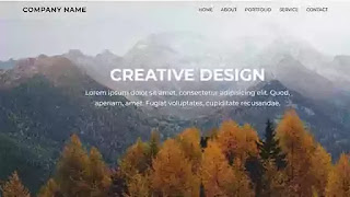
Hello Friends, in this blog, we will learn how to create a simple responsive website layout using HTML and CSS flexbox. now, what is CSS flexbox? CSS flexbox is a CSS property that helps to organize and align all the elements inside a wrapper. It is a css3 web layout model and is most frequently used by developers nowadays. I have shared many CSS animation examples, bootstrap, JavaScript, and HTML CSS-related snippets before in this blog. please make sure to check those as well apart from this one. For better understanding, I will suggest you follow the tutorial below and then come back to get the source code of this project.
I hope you have watched the video and understand the basic coding behind the project. In the tutorial, I haven't included the responsive part. I have tried to make the layout responsive later and included the code here for your convenience.
In this project, I have created a div named 'menu area and placed the logo and nav items there. In the logo part, I used simple text as the logo. You can use a png logo icon here. For the navbar, I have taken an unordered list with the name of 'nav' and created five nav items. I also linked the ids of the following section with the anchor tags so that when we click on a particular nav item, it will scroll to that section.
You may also like:
I have created five different sections [home, about, portfolio, services, contact] with a similar pattern. Each section contains a content box with a header tag and a p tag with some random text inside in it. For styling the whole project, I have used flex properties and values to style all the elements used in the HTML markup. You will see how CSS flexbox helps us reduced the code and, we make a simple webpage with a little bit of code. In the responsive media query part, I have made some changes in values so that the layout looks okay for the smaller devices. You can experiment more with the code you get and make it even prettier than it looks. I am providing the source code below so that you can play around with the code by yourself.
Create a Simple Website Layout using HTML CSS [ Source Code ]:
For making the website layout, you need to create two files. One is the HTML file with .html extension and, the other is the CSS file with .css extension. After that, add the external CSS in the HTML file. Please copy the code below from the code box and paste them into your files and save them. Now open the file in the browser and see how it looks. If it doesn't work then, double-check the code.
ADD HTML
ADD CSS:
I hope you have created your version of the snippet. Now try to make it even better with your knowledge. Please subscribe our YouTube channel and press the bell notification icon to get the notification for each video we publish. Please follow us on our social media profiles to stay connected with this blog. Thank you for stopping by this blog.


nice
ReplyDeletePost a Comment
Please Do not Enter any spam link in the comment box