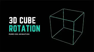
CSS animation is a powerful tool for the web development sector. Through this, developers can add various animations to their website or web page to make it more dynamic. This feature works by slowly changing an element's properties over time using keyframes. These keyframes have a start and end state. In today's blog post, we will share a snippet about CSS 3D animation. These awesome CSS effects are made with only HTML and CSS. The following CSS animation tutorial shows the process of creating the snippet. Before collecting the source code, take a look at the video tutorial below.
Video Tutorial:
Hope you have seen the tutorial on CSS 3D Animation. 3D Rotating Cube Animation is an animation that creates the illusion of a cube rotating in three dimensions. It uses CSS's 3D transform property to translate, rotate, and scale elements. This CSS 3D animation can be used for logo animations, product previews, loading animations, games, decorative elements of webpages, and more. There are some famous websites that use this CSS 3D animation or 3D rotating cube animation. Apple uses it for its product preview. Tech giant Google uses this feature to display their Google Maps in three dimensions. Besides, there are many other websites including Dribbble, and Codepen which use this CSS 3D animation feature.
To create this awesome css effects a file called '.container' is taken. This will basically be used to position the snippet. Inside this div, another div called '.cube' is taken which contains six child <div> elements, each representing a face of the cube. In CSS we have the entire webpage on a black color background. Then '.container' is given width, height, and a perspective value. We set the snippet to the middle of the viewport with a margin value. Then a transform style is given to the '.cube' div. This property is used to enable 3D transformation on child elements while preserving the 3D effect. An animation called "spin" is then applied. This will rotate the cube 360 degrees in both X and Y axis in 5 seconds. This creates a rotating effect by repeating infinitely. Each '.face' element is assigned a height, width, and position value. After styling each cube element, infinite rotating animation is given to the cube div. A rotating animation is given to the snippet via CSS Keyframes animation.
You may Also Like:
Rotating Cube CSS 3D Animation [ Source Code ]:
To create this visually appealing and interactive 3D rotating cube animation, we need to create a CSS and HTML File. After that, paste the following code into those files. Save the code and open it in the browser to see if it works. If not then download the code from the download button below.
ADD HTML:
ADD CSS:
We Hope this CSS 3D animation code is working properly for you. Click the Load More button on the homepage to get more such snippets. Share the blog post with others if you like it. Thanks for visiting our website.


Post a Comment
Please Do not Enter any spam link in the comment box