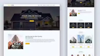
Hello, friends. Today, in this blog, we will learn how to build a Responsive Website using Bootstrap 5. In this Bootstrap 5 templates tutorial, we will learn about Grid System, Carousel, navbar, Button, etc. Please watch the video tutorial below before collecting the source code. This will help you to understand the source code. We have over 1000 videos about front-end development on our YouTube channel. If you are interested, you can visit and watch the other videos on the channel.
I hope you watched the whole video once. So today we will learn how to design a Fully Responsive Website. Website is one of the most important parts of any company's success. A good quality website can bring a lot of potential customers to a company. Besides, it also contributes to the growth of the company.
The website we are building has six parts. These sections are Home, About, Services, Portfolio, team, and Contacts. All sections are designed with the Bootstrap 5 framework. This website has been designed with very little CSS.
At the top of the homepage is a sticky navigation bar with a logo. The logo is on the left side of the menu and the main menu is on the right side. We have made this website look like a construction website. For this, I have added related headers for the banner text. I have taken the banner images of the houses so that it looks like it is a house developer or construction website.
Separate header, paragraph, and call-to-action buttons are used for each carousel item of the Bootstrap 5 carousel used here. After the homepage, a section header has been added in each section. Each section is given specific padding so that the content gets some space. In the About section, we have added a company image on the left and some company-related information on the right side. Elements for subsequent sessions have been created using bootstrap 5 cards templates. Lastly, the site has been made responsive using CSS media queries. This site will be nicely presented on different small devices.
If you have seen the Responsive Website video tutorial, I hope you understand the code well. I tried my best to make the video understandable. After each input, I have displayed its output in the video. If you enjoyed watching the video and find it helpful, please don't forget to like it and leave a comment.
If you like this Responsive Website and want to get its source code, you can collect the code from the code box below. If there is any problem with the code then download the code from the download button. After receiving the code, use your creativity to customize it more beautifully.
You might like this:
Bootstrap 5 Responsive Landing Page Design [ Source Code ]:
To create this free Bootstrap 5 Template, you have to create one HTML file with a .html extension and one CSS file with a .css extension. You can use either CDN files or, Bootstrap downloaded CSS and js files. For this project, I have used the downloaded versions. But if you want, you can use the CDN version as well. After adding the bootstrap files in HTML, add the external CSS file also. We are using bootstrap fonts, so add the bootstrap icons CDN in your project. after setting up the files, copy and paste the following codes into your file.
ADD HTML
ADD CSS:
I hope you have successfully implemented the code. If you find this useful, please share the articles with like-minded people and help us grow. Follow us on our social media profile to stay connected with this blog. Thank you for visiting our blog.


Too good
ReplyDeleteYour website is awesome your website will be in top
ReplyDeletethanks
Post a Comment
Please Do not Enter any spam link in the comment box