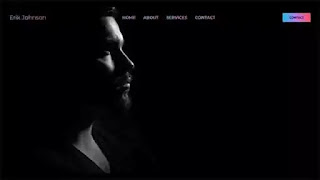
Hello friends, In this project, I will share a flexbox website homepage snippet with you. I have also made the homepage snippet (flexbox website template) responsive for the small devices using CSS media queries with some minor alterations of the CSS properties. In this blog, I have shared many projects on CSS animation examples, bootstrap, JavaScript, HTML CSS, and so on. Please check those as well, apart from this snippet. For a detailed understanding of the code, I suggest you follow the below video and then come back to get the source code.
I hope you watched the video and got some idea about the project. Now, what is css flexbox? CSS flexbox is a one-dimensional layout pattern. Using CSS flexbox layout, we can design flexible and effective web layouts. To create a website, we need a homepage first. In this snippet, we made a simple-looking homepage design with a logo, navbar, and a call-to-action button on the top-right side of the homepage. I also used a full-screen background image for this project. I didn't use any banner text in this homepage design template, because my main focus was to make a responsive flexbox navbar. I used basic CSS flexbox properties to create the snippet and, all of them are self-explanatory.
You May also like:
CSS Flexbox Homepage Layout [ Source Code ]:
To make this snippet, create an HTML file with a .html extension and then a CSS file with a .css extension. After That, link the external file with the HTML file. Please copy the code below and paste them into your file and save them.
ADD HTML
ADD CSS:
I hope you have created your version. Please subscribe to our youtube channel 'divinector' for free source code and tutorials. Also, press the bell notification and click 'all' so that you can get notified of all our upcoming videos. Follow us on our social media profiles and stay connected with the blog. Thank you for vising this blog.


supper nice
ReplyDeletePost a Comment
Please Do not Enter any spam link in the comment box