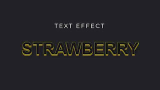
Hello, today we will share another snippet about CSS text animation. This simple text animation is basically made with a CSS text-shadow effect. So today we will learn how to create a nice text hover animation using the text-shadow property. Before collecting the source code, watch the video tutorial below. This will give you an idea of the code. There are many videos on our YouTube channel about CSS animations. You can watch them if you want. And if you like our videos then subscribe to our channel.
You must have seen the video once. If I have to say something about CSS Animation I would say that if you want to have a visually appealing website then CSS is an easy option for you. You don't need to go for complicated javascript or jquery code. CSS is here to do that for you. CSS Animation also enhances the user experience as well. In addition, CSS animations are lightweight so your website speed will remain smooth. We used the CSS Text Shadow property to give our text a 3D look on hover. For those who don't know, the text-shadow feature adds shadows to text. We have to add a list of shadows separated by a comma to the text we have. You can make the shadows in any direction you want.
You May Also like:
3D Text Animation on Hover [ Source Code ]:
Create an HTML and a CSS file. Link the CSS file to the HTML file. Copy the code from the code boxes and paste it into your project. For any inconvenience, download the source code from the download button below.
ADD HTML:
ADD CSS:
I hope the code is working. We added a load more button so our homepage visitors can find more code snippets. It provides more code samples that can help you learn new things. Thanks for visiting us.


Post a Comment
Please Do not Enter any spam link in the comment box