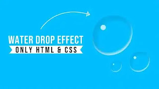
In this post, we present a beautiful pure CSS example of a water droplet that looks like a real one. We will provide a tutorial link and source code on how to make a realistic-looking water droplet using pure CSS. Pure CSS water droplets are easy to make, and they look great. In the video tutorial below, we have shown how to create this CSS dropmorphism or rain droplet effect step by step. If you want to see the detailed procedure of making the snippet, please consider watching it. If you are interested in frontend development, you can subscribe to our youtube channel.
I hope you have watched this short video. I'm hoping you've seen water droplets in the real world or artists drawing water droplets on their canvases. It is possible to do it using basic HTML and CSS properties as well. You just need some basic CSS properties like border-radius and box-shadow to create this effect.
In this project, we have taken a div called 'wrapper' and positioned it in the middle with the help of CSS flex property. Before that, we eliminated the default margin and padding of the project. Then comes the real water droplet effect. First, we have given 300px width and 300px height to the main div element. Then we gave position relative value to it. To make the div look like a water droplet, we have rounded the corners around it with the CSS border-radius property. We used the inset value of the CSS box-shadow property to create the reflection that occurs on one side of the water droplet when light falls on it. We have used the CSS pseudo-element after to make the drop of white light visible on the droplet. Watching the above video will help you a lot to understand.
You May Also Like:
Pure CSS Realistic Water droplet [ Source Code ]:
You need to create the necessary files like HTML and CSS first and link them properly. Place the code from the below boxes into your project. You can test it in your browser to check if the code is working or not.
ADD HTML:
ADD CSS:
Let us know if the code is working for you. Your feedback is very valuable to us. Let's get social! If you liked our website's content, then please share it with your friends. Please cooperate with us. We can’t move forward without your cooperation. Thanks for taking the time to visit our site.


Post a Comment
Please Do not Enter any spam link in the comment box