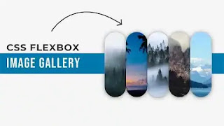
Image gallery is a powerful tool that can keep visitors engaged on any website and create an attractive website layout. With this image gallery, a company can present its products, services, or any other content to its audience in an organized and attractive manner. Today we will create a responsive CSS flexbox image gallery where some images will be presented vertically side by side. If we hover over an image, it will expand with a smooth transition. Once the hover is gone, it will return to its previous state. The coding process for this snippet is shown in the video tutorial below. Watch the video before collecting the code.
Video Tutorial:
Hope the video tutorial gave you an idea of what the snippet will look like. Images are a powerful element on any website. A natural tendency of visitors is that they prefer images more than written content. So if the image can be presented to the visitor visually and organized, then the user experience of that website is enhanced. If the image of your product can be displayed attractively through the gallery, then in many cases the product description is not even necessary. If you visit any e-commerce website, you will see how well they present their product images to the visitors.
In this CSS Image Gallery Snippet, all the images are styled to remain organized in a grid or row and evenly spaced. When the users hover over an image in this gallery, the image will enlarge and we can watch it in detail. To make the hover effect smooth we used a cubic bezier CSS transition which you can see in the video above. The initial container width is 600 pixels. But for small devices, its width is set to 100% so that the CSS image gallery takes the full width of the device.
You May also like:
To create this CSS flexbox image gallery or CSS responsive image gallery, first create an HTML and a CSS file. Then copy and paste the code from the code box below and take it to your project. After saving the code, try to open it once in your browser. If the code doesn't work properly, download the code from the download button below.
ADD HTML:
ADD CSS:
Hope this Responsive Image Gallery Snippet is working properly in your browser. We have hundreds of other similar snippets on this website. To get these, simply go to the homepage of our website and click on the Load More button below. Scroll down and you might find a snippet you like. If you like our website content, please share it with others on social media. Thanks for spending your valuable time on our website.


Post a Comment
Please Do not Enter any spam link in the comment box