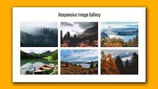
Hello friends, In this blog, we see how to create a responsive image gallery using Materialize CSS. On this website, I have shared many projects on CSS animation examples, HTML CSS, JavaScript. Please make sure to check those as well apart from this project. For this snippet, please follow the below video tutorial for better understanding.
I hope you have watched the video and got some ideas. All websites nowadays have some media elements on them to show their users. The image gallery is one of them. It is usually used to showcase the work of a company or individual. Many people use some jQuery plugins like the magnific popup to make this image gallery more interesting. But we didn't use anything like that here. We created a simple image gallery where we used materialized CSS. Materialize is a library made up of HTML, CSS, and JavaScript. This CSS framework is inspired by Google's material design. We know of another such library and, its name is Bootstrap. This image gallery is fully responsive means the gallery can be adjusted to any small device.
You may Like this:
Responsive Image Gallery using Materialize [ Source Code ]:
For this project, you have to add materialized CSS and js files with your project. You also have to add the latest jQuery file. After that, create one HTML file with a .html extension and CSS file with .css extension. Add the external CSS in HTML file. Please Copy the code from the code box below and paste it into your project.
ADD HTML
ADD CSS:
I hope you have successfully implemented the code. If you like this project, then consider subscribing to our YouTube channel. Follow us on our social media and stay connected with this blog for more. Thank you for your visit.


Post a Comment
Please Do not Enter any spam link in the comment box